GLUE 2021: The Color Issue #3: Objekte Unserer Tage
Het relatief jonge (2015) Berlijnse label Objekte Unserer Tage (OUT) heeft zich de expliciete doelstelling gesteld om hedendaags wonen te combineren met traditioneel vakmanschap. Alle producten worden dan ook lokaal vervaardigd, duurzaam en eerlijk. Hun ontwerpen zijn ontegenzeggelijk modern maar zeer degelijk uitgevoerd en tot in de kleinste details goed doordacht.
Toen wij het merk voor het eerst zagen vielen we als een blok voor het waanzinnige kleurenpallet dat OUT gebruikt. Dat de meubels ook heel goed gemaakt zijn maakt het een onweerstaanbaar merk voor ons.
OUT is opgericht door Christoph Steiger, David Spinner en Reinhard Wessling, jonge ontwerpers die vrij snel na hun afstuderen een eigen label startten. In Nederland nog niet zo bekend, maar in Duitsland zeer succesvol!
To determine the colors for a production, how do you proceed, what is the way you work?
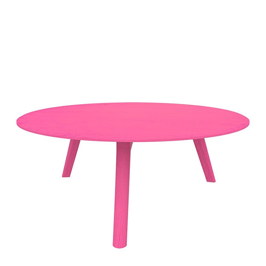
OUT is all about colors. We love vibrant and bold colors, that you wouldn't expect in most furniture collections. All colors are inspired by our life in Berlin, the nightlife as well as our families and friends or even simply a new Netflix show we fall in love with. The city can be quite dark and gloomy in winters, we want to offer colors that transfer joy and good vibes. When we choose a color, we try to avoid the "safe" color, that seems "sensible" or "rational". We try to think, what would bring you joy? Do you choose grey because it's "safe" or do you really love it?
Can you give examples of color (combinations) of your designs that you were particularly fond about?
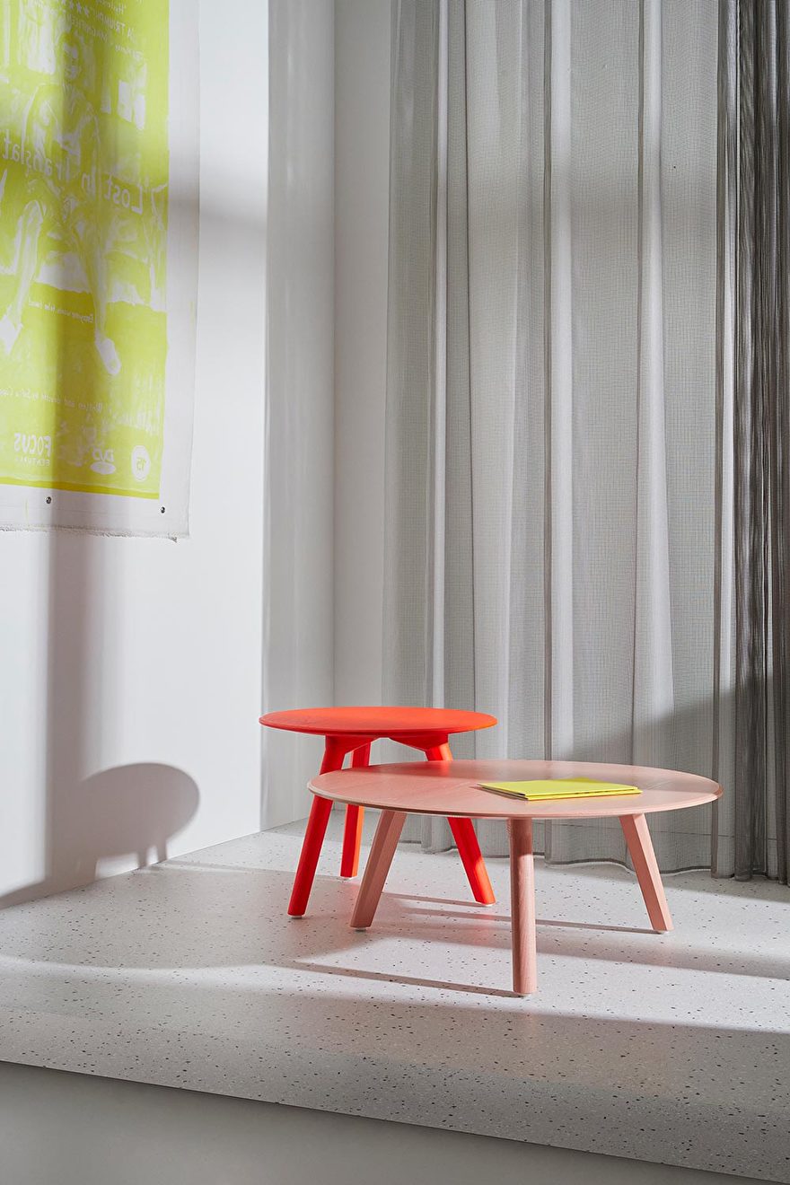
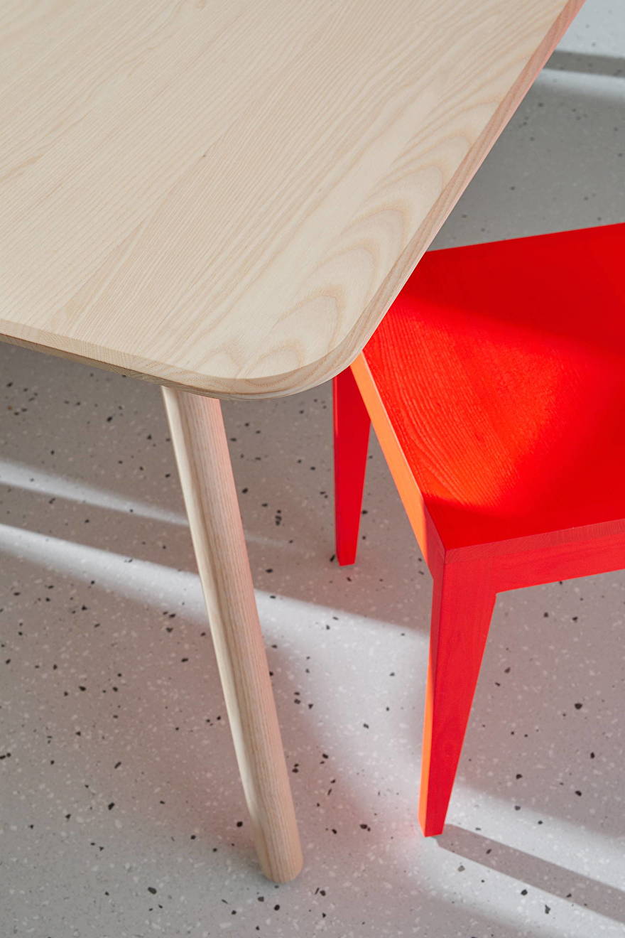
We love to combine furniture pieces in ash wood with white pigment with luminous red lacquered pieces. The sustainably sourced ash basically has the look of fresh cut wood. The luminous red adds some contemporary reference to it - definitely an aesthetically appealing combination. Also colors that traditionally would be considered as a "no match" can make a great match in our view. For instance aprikosa and luminous red work fantastically together. Perhaps my mum wouldn't necessarily agree with it. :)) But for us it's aesthetically very appealing to play with traditions and expectations. It can offer a new perspective on colors and what we think is "appropriate" or "expected".
Are there any colors that you dislike? Are there any colors that you find exceptionally beautiful? And in that context: are there also colors that you have to avoid because you notice that you use them too often in your designs?
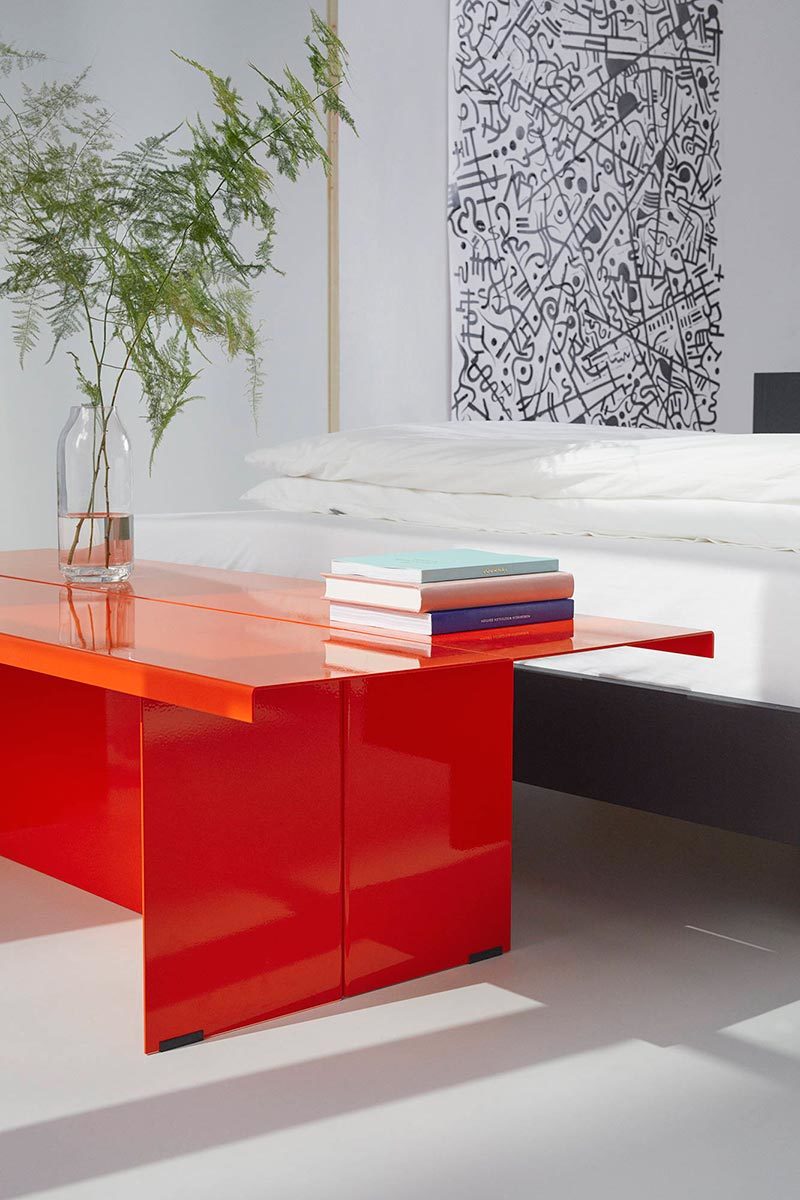
We definitely love the luminous red on all materials. On wood it's such an AHA moment, since the traditional material works fantastic with the contemporary color. Also on metal it's fun to work with - the color is extremely intense and radiant. Since on metal the color is not UV-resistant, a natural patina and color variance develops over time, which makes every object in luminous red a unique piece, which is fantastic! We are one of the few brands to use the color, since it's very challenging to apply and costs a lot of time.
When picking a color do you doubt a lot or are you very sure about choosing?
We try to pick what we think will transfer joy and add to this world. So no, we don't doubt much. When we have to choose, we try to choose the more fun and bolder color. There are too many "safe" choices in the market already. We of course also rationally think about what color scheme we're missing in the collection. We then try to create a color in that scheme that reflects our values and beliefs.
Are there other artists or designers who inspire you in terms of color?
Hm, perhaps Norbert Bisky from Berlin! For us he's one of the most important contemporary German artists.
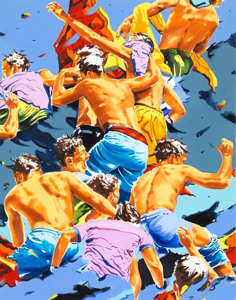
'Muster' van Norbert Bisky
Can you tell something about and how you become influenced with regard to color choices? For example your emotion, the season, the fashion, general color trends etc
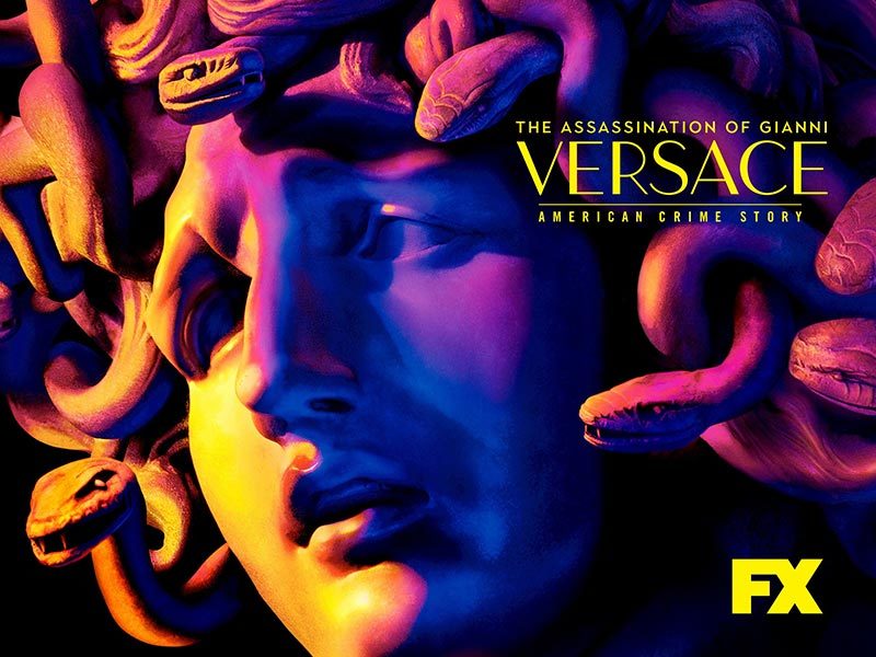
Well, our inspiration is the city of Berlin, our friends and family. But also random things like a Netflix show. A few years back we got so hyped about the "American Crime Story - Assassination of Gianni Versace", that we created our nasty 90s color miami pink. It's a colorful murder story, it's creepy and psycho. The aesthetics were on point and captured us. So why not?